Simple Regression Analysis by Scatter Plot in Excel【Regression Analysis Series 1】
This post shows the basics of Regression Analysis, explains its confusing terms, and how to use a Scatter Plot for a Simple Regression Analysis.
(Duration: 7:49)
Purpose of Regression Analysis
Hi, this is Mike Negami, Lean Sigma Black Belt.
Our topic today is from this request.
“Please explain Multiple Regression Analysis and correlation that can be used in business forecasting and customer satisfaction research analysis etc.”
Thank you, Katsu RD for your request. In order to answer his question, I have to explain the basics of Regression Analysis first, so I divided this topic into three videos.
- This time = Simple Regression Analysis with a Scatter Plot,
- 2nd Time = Simple Regression Analysis with the Excel Data Analysis Tools,
- 3rd Time = Multiple Regression Analysis.
These days, with the development of IT, most companies can gather a lot of data. That data is the result of your business activities.
Regression analyses give us good hints about the causes of the business activities and factors that affect those results. The real purpose of analyses is to use them for your future activities. It’s true for any data analysis, that you cannot stop with just making them.
Case study of the Simple Regression analysis
Regression Analysis already sounds complicated. I thought that it’s easier to understand Simple Regression Analysis by learning from an actual experience that I had.
I regularly post articles on this blog site, econoshift.com, then make a video for YouTube. First, I write a blog post and then make a video about the same topic. I wanted to predict video duration from the number of words on the blog post.
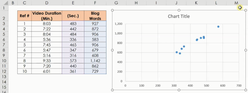
I gathered ten sets of sample data of the number of words in past blog posts and their video durations. The video duration I wanted to predict is Y, which is called the ‘Objective Variable’ and the number of blog words is X that should be written as a factor and this is called an ‘Explanatory Variable’.
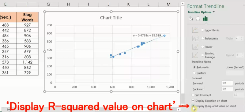
From a Simple Regression Analysis, we can express the Objective Variable by the equation: Y = a X + b. This expression is called a ‘Regression Equation’. For my data, from the result of the Simple Regression Analysis, it became Y = 0.47 X + 35.5.
The 0.47 portion is called a ‘Coefficient’ and represents the slope of the line of the Regression Equation. For my equation, if X increases by 1, Y increases by 0.47. Also, the +35.5 portion is called an ‘Intercept’ and represents the value of Y when X is 0.
From my equation, if the blog has 600 words: X is 600, 0.47 times 600 plus 35.5 equals 5 minutes 18 seconds. I can predict video duration quite accurately with this and it’s very helpful.
In this example, since there is only one Explanatory Variable, it’s a Simple Regression Analysis. When there are two or more Explanatory Variables, we’ll use Multiple Regression Analysis. The Multiple Regression Equation looks something like this:
Because I want my video to be about 5 minutes, I always check the video duration with this formula before I film my video and utilize the result to decide whether to add more content or sometimes divide the content into two videos. In fact, I divided today’s topic into three videos because of this equation’s result.
The Scatter Plot in Excel gives us a Simple Regression Equation and Coefficient of Determination.
Let’s do the Simple Regression Analysis with Excel. Before doing a Simple Regression Analysis, it’s good to make a Scatter Plot first and visualize the data.
Simply select the source data and select ‘Insert’ and then in the ‘Charts’ section, select ‘Scatter’.
It seems that the data have a positive correlation. However, the Objective Variable, which is the video duration, should be on the vertical axis, but here they are reversed. Click on the ‘Design’ tab, the ‘Select Data’, then ‘Edit’ and switch around the data groups.
Next, in the same ‘Design’ tab, select ‘Add Chart Element’, ‘Trendline’ and ‘More Trendline Options …’. On the right screen, select ‘Linear’.
Try to select other models. As you change the selection, the line on the chart also change. If other models are better fit than Linear, it’s better to use that.
I’ll use ‘Linear’ this time. Then, check ‘Display Equation on chart’ and ‘Display R-squared value on chart’. Now a Regression Equation has come out.
What is this R-Squared value? This is also called the ‘Coefficient of Determination’. There is another similar concept, which is called ‘Correlation Coefficient’.
Lastly, I’ll summarize these confusing terms clearly. The Correlation Coefficient is a numeric value between -1 and +1, and the closer it is to -1, the stronger the negative correlation, the closer it is to + 1, the stronger the positive correlation.
The R-Squared value and Coefficient of Determination are the same thing and it’s the squared value of the Correlation Coefficient. So, it’ll be a value between 0 and 1.
It represents that the closer it is to 1, the more accurately the Regression Equation can calculate the Objective Variable.
“See these other popular articles.”


