How To Use The Scatter Diagram – Exclude “Outliers”!【Excel Template】
The following action is more important than creating with Scatter Diagram. From the coefficient of determination, it is a starting point to consider whether there is a strong correlation between the two data groups and a causal relationship. It is essential to exclude any outliers in the scatter plot. I will show you how to do it on the Excel template.
(Duration: 5:19)
DOWNLOAD ← Click this to download the Scatter Diagram template file.
<< Related Videos >>
- How to write a Histogram and How to use Stratification 【Excel Template Practice】
- The 7 QC Tools: How to Make a Control Chart and Spanish Template【Excel Template】
What’s ‘Correlation’, which is the basic of the Scatter Diagram?
Hi, this is Mike Negami, Lean Sigma Black Belt.
Today, I’ll introduce one of the 7 QC Tools, the Scatter Diagram, which is often used in the Analyze Phase. I’ll explain how to use it by using an Excel template.
The Scatter Diagram is used to find if there is any statistical relationship between a pair of datasets, for example, between daily sales in an ice cream parlor and daily highest temperatures, or between people’s heights and weights. This statistical relationship is called correlation.
When one dataset increases and the other dataset also increases, we say “They have positive correlation.” If it’s opposite, “They have negative correlation.” One consideration here is that even if there is correlation, you cannot say that the two datasets have a proven cause-and-effect relationship. However, correlation gives you a big clue for that.
Also you can find if there is no correlation with the Scatter Diagram. For me, when I have a pair of datasets, I use the Scatter Diagram more often when I want to know if there is no relationship in the two factors.
How to use the Scatter Diagram template
Let’s make a Scatter Diagram right now. You can download the Scatter Diagram template by clicking the link below. After opening the template file, enable the VBA by clicking the buttons, “Enable Editing” and “Enable Macros”.
DOWNLOAD ← Click this to download the Scatter Diagram template file.
First, you’ll prepare a pair of datasets in the two columns in Excel for which you want to check correlation and open the file. Then, click “Click this to generate a Scatter Diagram.”
Excel is asking “Is an Excel file that has your data open for a Scatter Diagram?” Click “Yes”. Then, you’ll be asked “Is this the correct data file?” If it’s correct, click “Yes”.
Select the three columns of data factor names and the two datasets. Optionally, you can select only the two dataset columns (B2:D32: See the image above.). If your data has data headers, include them. Then, click “OK” and see the result. Excel is saying I’ll“You can eliminate an outlier by clicking that plot in the diagram, then R2 will be re-calculated.” explain this a little later.
How to interpret the Scatter Diagram

This is a Scatter Diagram. One of the datasets is on the horizontal axis and the other dataset is on the vertical axis. The dots are plotted across from both of the datasets in the diagram. They seem to be showing an uphill tendency. They may have a positive correlation.
This says “R2 =0.4128” in the chart above. It’s called “the Coefficient of Determination”. The value is between -1 and +1. As it is close to +1, it interprets that there is a strong positive correlation. Conversely, as it is close to -1, there is a strong negative correlation. Also as it is close to 0, there is no correlation.
Generally speaking, you can say that there is a strong correlation if R2 is more than +0.5 or less than -0.5. However, this is just a guideline. You should verify it with other information.
Exclude “Outliers” our of your Scatter Diagram.
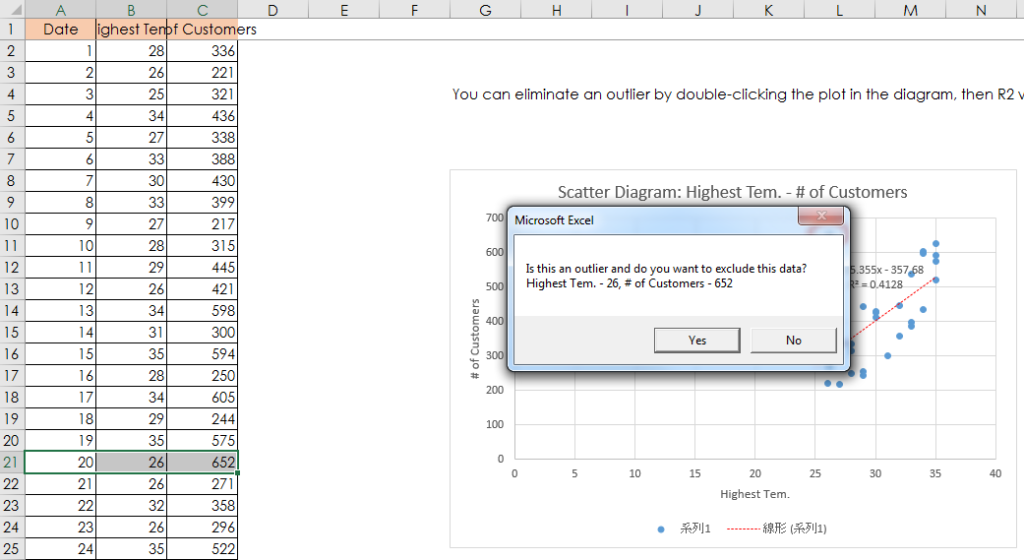
What you have to be aware of is the presence of “Outliers”. These datasets are the daily number of customers in an ice cream parlor and each day’s highest temperature. The dot in the red circle in the chart above is an outlier. Even though that day’s temperature was low, they had many customers.
Click the dot, then Excel will ask “Is this an outlier and do you want to exclude this data?” You can see this highlight and know this data is on the 20th.
Upon investigation, they had an unusually big customer group on that day. Since this is unusual, let’s exclude the data, so click “Yes”. Then, Excel excludes that dot and recalculates R2. It became 0.6379. Since it’s more than 0.5, there is a strong positive correlation. Therefore, statistically, this ice cream parlor gets more customers as temperature increases.
Today, I talked how to make a Scatter Diagram and how to interpret its result.


