How to make a Pareto Chart – This is the first step of Data Mining! 【Excel Template Practice】
You can make a Pareto chart from scratch in Excel, but use the Excel template to instantly create it, and use your time to think about and execute your next action plan from the results. This article explains how to make a Pareto chart with the template and how to interpret the result.
(Duration: 5:09)
DOWNLOAD ← Click this to download the “Pareto Chart” template file.
<< Related Videos >>
- 【What are the 7 QC Tools?】 Flowchart, Histogram, Pareto Chart: These are some of the 7 QC Tools.
- How to write a Histogram and How to use Stratification 【Excel Template Practice】
Review of the Measure Phase of DMAIC
Hi, this is Mike Negami, Lean Sigma Black Belt.
In the previous video, I explained the 3 steps of the Measure Phase. Here is a recap:
1, Identify the most important CTQ, Critical To Quality from the VOC, Voice of Customers.
2, The CTQ becomes ‘y’. Find the internal factor, ‘x’ in the equation y = f(x).
3, Make a measurement method to evaluate ‘x’ and ‘y’ if possible.
<< Related Videos >>
Let’s talk about a case study today. According to my fictitious project’s project charter, since our target process has a very high product return ratio of 3.8%, we are required to decrease it to the national average of 2%. This product return ratio is not the VOC, but rather is the result of the VOC. This product return ratio itself becomes the CTQ.
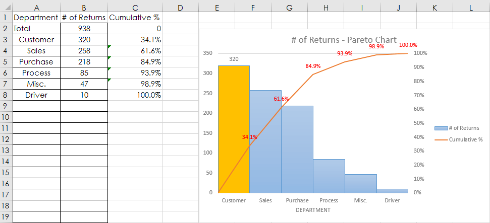
Then, assuming the product return ratio is y, what is the internal factor for the equation y = f(x)? Fortunately this company tracks product return reasons and we can populate the return ratio from their database. This is that data from the database. Here are the return reasons in Column A, responsible department in Column B and the numbers of returns for the past 3 months in Column C.

Now we would like to know which are the high-ranking department. It’s a golden rule to prioritize the few factors that impact the most. We call them the “Vital Few” in Lean Sigma. We can find them just at a glance with a Pareto Chart.
Short Introduction of the 7 QC Tools
I would like to talk about the 7 QC Tools. The Pareto Chart is one of them. It’s a very common practice to use them in manufacturing processes. It’s contributed greatly to Japan becoming number one in the world for quality. There is no way to avoid using them in non-manufacturing processes.
I made a Pareto Chart Excel template as well as some other tool templates of the 7 QC tools. I’ll talk you through them in future videos. You can download and use the Pareto Chart template by just clicking the link below.
DOWNLOAD ← Click this to download the “Pareto Chart” template file.
How to use the Pareto Chart Template

This is the actual template. Here are the instructions. Please refer to them later. Since this file uses Macro, click these buttons first to enable it. After opening your data Excel file, click this here to generate a Pareto Chart.
Excel asks “Is an Excel file that has your data open for a Pareto Chart?” Click “Yes”, then Excel will look for another opened Excel file and prompt you with “Is this the correct data file?” If yes, click ‘Yes’, but if it’s not, so I’ll click ‘No‘. Then Excel will ask the same with another file.
Since this is the correct file, I‘ll click ’Yes‘. Then you’ll be asked “Select your data range (2 columns with a text column on the left and a numeric column on the right)”. I’ll select the part on Column B and C. If your text data in Column B has duplicates, Excel will automatically delete them and tally the numeric data in Column C.
My data didn’t include header titles, so I’ll enter them. It says “The bar(s) in orange are Vital Few (Top 50%).” and your Pareto Chart is generated in a new sheet.
Interpretation of the Pareto Chart Result
According to this result by department, ‘Customer’ is the top. The 2nd is ‘Sales’ department. Those 2 factors are responsible for 61.6% of the total number of product returns. These are Vital Few. Since the Sales department has to deal with customer mistakes, it’s become clear that this project’s focus is the Sales Department.
This is great progress in the project! I always use a Pareto Chart in the Measure Phase as long as data is available. This is the completion of this episode.
Thank you for viewing. If you like my videos, please click the subscribe button. Thanks.