What is the basic of data analysis? That’s the PDCA Cycle! (DMAIC: Analyze Phase)
PDCA Analysis: Data analysis and PDCA cycle are closely related. It explains how to utilize the PDCA cycle for data analysis, and how to perform “actionable” data analysis that can produce results and encourage actions.
(Duration: 5:54)
<< Related Posts >>
- PDCA Cycle – How to Utilize Data Analyses in Service Operations【Foundation of PDCA Cycle】
- Management’s PDCA Cycle: Apply Quality Control’s PDCA Cycle for【Leadership】
What is the basic of data analysis?
Hi, this is Mike Negami, Lean Sigma Black Belt.
In Lean Sigma, it’s an iron rule that our projects should progress based on data and facts, so making good analyses is very important. Therefore, I’ll talk about a fundamental basic of data analysis today.
The most fundamental thing, which I’ve talked about this many times in my videos, is the PDCA Cycle. “Consider including data analyses along with your project’s PDCA Cycle.” If you haven’t watched those videos, please do so by clicking the link here.
<< Related Posts >>
For quick summarizing, the PDCA Cycle is fundamental for any activity’s success.
P is for Plan. Make a plan at first.
D is for Do. Execute the plan.
C is for Check. Evaluate how you did according to the plan.
A is for Act. Act or improve according to the Check. Then, continue to the next cycle’s Plan.
Among the PDCA steps, when would you mainly do data analyses? It would be at the ‘Check’ step. Conversely, “Check” without any data is as though you’re driving to your destination without a GPS.
The PDCA Cycle among a Data Analysis
The first step is “Plan”. You need to think of what the project’s purpose is and what they’re trying to achieve. This is the most important thing in making a data analysis. At work, I’m often asked to make a data analysis. I’m told to do it this way or that way. But I always ask what the purpose is and what the person is trying to achieve. With that, I’ve made better results.
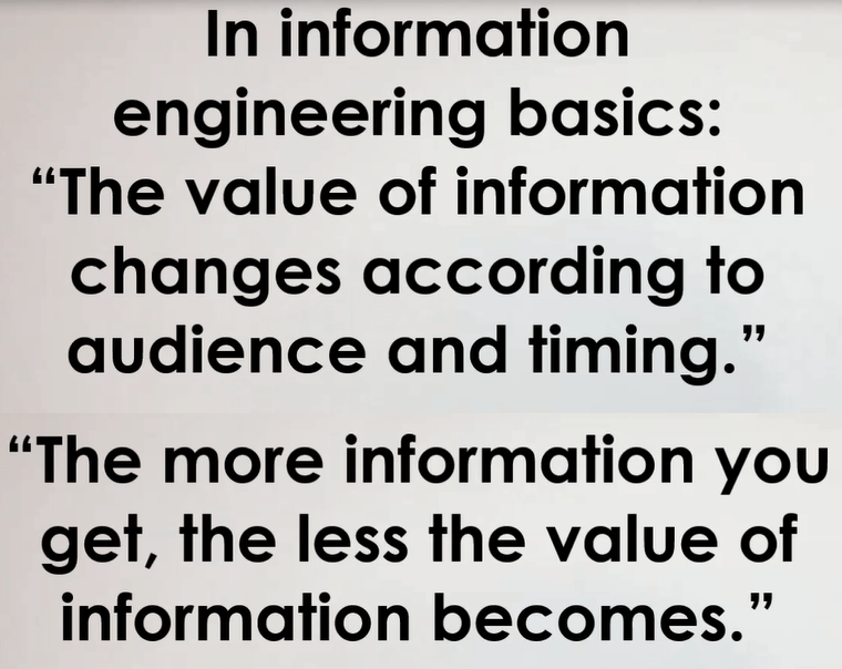
In the “Do” Step, think about the situations in which people will use your data analysis, such as the timing and how they use it. In information engineering basics, there are saying such as “The value of information changes according to audience and timing.” Also, “The more information you get, the less the value of information becomes.” Therefore, you should change your analysis’s content and appearance according to your audience or the timing of when they use it. Also, make your analysis show the minimum amount of necessary information as possible.
Lastly in the “Act” step, when your audience sees your data analysis, you expect that they’ll take some kind of action, right? Therefore, you should select information and an appearance that prompts the audience to do that expectation. Your data analyses should be actionable. “Actionable” is a keyword in data analyses.
Sometimes, I see data analyses with beautiful charts, but without any clear intention. I wonder if the analyst made the analyses while to be considering the audience. I usually pretend to be one of my audience members and consider which part of the data he would see and what he would like to know in order to take the next action.
An Actionable Data Analysis Example
Here is an example of making analyses actionable.
<< Bad Example >>

This data shows last and this months’ sales and gross profits by customer, and their chart. They look nice at a glance. I asked the client what they want to do from this analysis. Then, I was told they want to find customers with decreased sales and make promotion targeted to them.
If so, this chart is useless for that. Let’s delete it. Put a subtract formula of “this month’s sales” minus “last month’s sales”, which means if the value is negative, the sales were decreased. Move your cursor onto the right-bottom corner of the cell, then your cursor will change to a black cross shape. Double-click on the cross, then the formula will automatically be applied to all cells in the column.
Select the header title row. Click “Home”, under the “Editing” ribbon, click “Sort & Filter”, and select “Filter”, then you can see upside-down triangles, which are filters. Click the filter in the newly made column and select “Sort Smallest to Largest”. You’ll see the customer whose sales have decreased most at the top at a glance.
<< Good Example >>
There are many tips like this, but what’s important is to consider including data analyses among the flow of your PDCA Cycle. From that, you should be able to think of good ideas easily.
Today, I talked about a data analysis fundamental.
Thank you very much for viewing. Please click the ‘Subscribe’ button. Also click and watch my other related videos. Thanks.


