Control Chart Types: You’ll understand Xbar, c, u, p, np with this!

The type of your data will decide what type of Control Chart you should use. The Control Chart Quick Reference Table gives you great guidance and explanations.
(Duration: 8:45)
How to decide which Control Chart you should use.
Hi, this is Mike Negami, Lean Sigma Black Belt.
Today’s topic is from this request:

“Could you please make a video about what the difference between an Xbar-R Control Chart and Xbar-S Control Chart is and what an R Control Chart, X Bar Control Chart, P Control Chart are?”
Tuan, thank you for your request. I totally understand why he made this request. There are many types of Control Charts and there are very few learning materials that easily explain this topic out there.
I’ll tell you beforehand that while I won’t show you any formulas, I’ll explain the differences between the eight Control Charts in an easy-to-understand way.
By the way, I made a template of an Xbar-R Control Chart and wrote an article about how to interpret the result after creating a Control Chart. You may want to read that article first to understand the basics.⇒”Xbar-R Control Chart: Let’s make it with Excel and Spanish Template【Excel Template】”
The difference between the Xbar-R and Xbar-S Control Charts
I’ll answer the first question about the difference between the Xbar-R and Xbar-S Control Charts. See the image below. The left chart is the Xbar-R Control Chart and the right shows the Xbar-S Control Chart as examples.

Xbar Control Chart is dotted the averages of the data groups.
Each of the Control Chart consists of two Control Charts. Both of the upper halves are Xbar Control Charts with the averages of the data groups dotted in chronological order. You can see a big flow of data with this chart.
Xbar-R and S Control Charts are for seeing the variation of the data group.
The lower half of the Xbar-R is the R Control Chart. R stands for ‘Range’ and it’s the difference between the maximum value and the minimum value of each data group. The R chart dots the range values in chronological order.
On the other hand, the lower half of the Xbar-S is the S Control Chart, which stands for ‘Standard Deviation’ and dots the standard deviations of each data group. Both have the same purpose and you can see the variation of the data group with them.
How to use the Xbar-R and the Xbar-S Control Charts differently
Now, how can you use the Xbar-R and the Xbar-S Control Charts differently? It depends on sample size. In practice, we periodically measure data as samples. The sample size is how many samples you take at that time.

The image above is the Xbar-R Control Chart and its source data. Its sample size is 5. As the sample size of the data group increases, the R Control Chart loses its accuracy. If so, the S Control Chart is better for larger sample sizes.
Although there is no global standard, in general, if the sample size is 9 or less, we use the R Control Chart. If it’s more than 9, we use the S Control Chart.
The answer was quite easy. The Xbar-R is a Control Chart with the Xbar and the R Control Charts. The Xbar-S is a Control Chart with the Xbar and the S Control Charts.
Control Chart Selection Quick Reference Table
It becomes a little challenging the next question. How do you use the other Control Charts differently? There is one answer. It depends on the data you use.

‘Variable’ = Measured Data Values
I made a quick reference table. The Control Charts are divided into two groups according to the type of data we use.
The first group is ‘Variable’. It has measured values such as length, weight, temperature, voltage, etc. This data type is continuous numbers and it can have decimal numbers and negative values.
Then, we’ll divide the group more. The next checkpoint is their sample conditions. As I mentioned earlier, if the sample size is consistent and more than 9, use the Xbar-S Control Chart, 9 or less, use the Xbar-R Control Chart.

When data is very biased, it may be better to use the median rather than the average, so you may rather want to use a Me-R Control Chart.
Sometimes you may not have a consistent sample size for some reason. Then, the sample size would be 1 and we would dot each data value. That Control Chart is an X-R Control Chart.
‘Attribute’ = Counted Data Values
The other data types have counted value. We call it an ‘Attribute’. We usually count the number of defects or defectives. Since this is counting numbers, it cannot have decimal numbers or negative values.
The Control Chart to be used depends on whether you’re targeting defects or defectives. What’s the difference between the two?
For example, if there are three scratches on one manufactured part, the number of defects is 3 and the number of defectives is one.
The next checkpoint is the sample condition. However, unlike before, the difference in size doesn’t matter, but whether the sample size can be consistent or not matters.
From these two checkpoints, the following four Control Charts will come out.
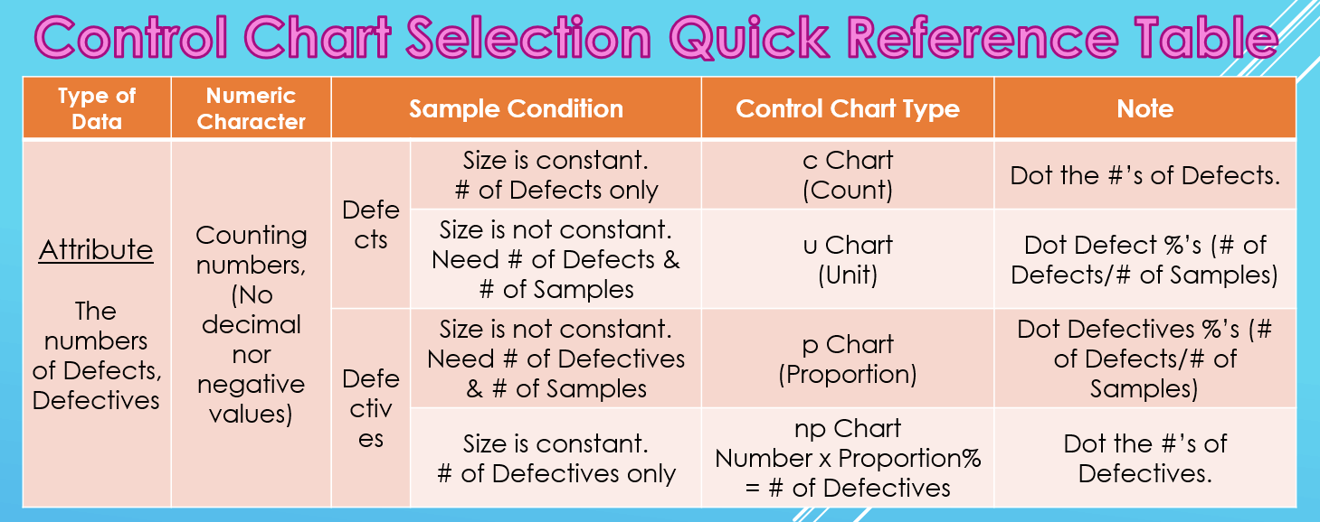
c Control Chart
If you want to manage the numbers of defects and can keep the sample size consistent, record only the number of defects and use the c Chart. ‘c’ stands for ‘Count’. You simply dot the numbers of defects.
u Control Chart
When the sample size is not consistent, you can’t compare the face values, so it’s necessary to record the number of samples each time as well. Then, use a u Chart. ‘u’ stands for ‘Unit’. You dot the defect percentages per unit, which are the number of defects divided by the number of samples.
p Control Chart
Next is the case where you want to manage the number of Defectives. Like the u Chart, if you can’t have the sample size consistent, record the number of Defectives and the number of samples, then use a p Chart. ‘p’ stands for ‘Proportion’. You’ll dot the Defective’s percentages, which are the number of Defectives divided by the number of samples.
np Control Chart
Lastly, when you want to manage the number of Defectives and can make the sample size consistent, record only the numbers of Defectives and use an np Chart.
‘n’ stands for ‘Number’ and p stands for ‘Proportion’. The total ‘Number’ x ‘Proportion’ % = # of Defectives and you dot the numbers of Defectives.
Today’s Conclusion
The conclusion is very simple. The type of your Control Chart will be decided naturally depending on what you want to manage, what kind of data you can get and if you can have a consistent sample size or not.
That’s been said, it’s better to rely on software to create Control Charts these days. For example, the software I use is QI Macros, which is an Excel add-in. After you prepare appropriate data, this software determines the type of Control Chart and makes it automatically.⇒”Control Charts: Which Control Chart Should You Use? – QI Macros”
“See these other popular articles.”