Use an Affinity Diagram to organize your issues/ideas.【Excel Template】
You can list up all the issues/ideas in the Affinity Diagram, organizing them by affinity and create group names easily. This Affinity Diagram is very useful when you don’t know what to do with problems or when you have a lot of unclear ideas and want to think about what to do next.
(Duration: 6:02)
DOWNLOAD ← Click this to download the “Affinity Diagram and Prioritizing” template file.
<< Related Posts >>
- 【From Covey’s “7 Habits” book】 How to Manage Our Time – “Quadrant 2”
- 5 How Analysis: List and organize ideas【Excel template】Great for 5 Why Analysis too!
Affinity Diagrams to organize issues / ideas
Hi, this is Mike Negami, Lean Sigma Black Belt.
I’m writing a book right now with another author and it’s a novel. As you’re enjoying reading the novel, you can learn Project Management and Lean Sigma. I would like to publish this book this year.
The co-author created a lot of problems in the book’s fictional company and the main character is struggling about what to do next. One thing he used was the Affinity Diagram, which is also called the KJ Method. I made an Affinity Diagram template and it has a function for you to prioritize your ideas.
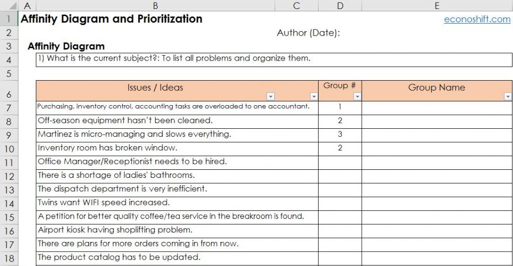
This image above is a completed example. You can write down all your idea items and organize them by affinity and think about group names. This gives hints to think about the next action plan from out of many problems.
For another application, this Affinity Diagram is also very useful when you have a lot of unclear ideas and want to think about what to do next.
There are 12 problems, from big to small for one chapter, in the company my co-author made. Let’s organize them using the template.
How to use the Affinity Diagram template
The instructions are written on the right side of the template. Write the subject of your ideas. This time, I wrote “To list all problems and organize them.” (See Cell B4 below.)
Next, I’ll write all the problems mentioned earlier in Column B. This is what I did below. Since you’ll use those sentences to prioritize them later, make them short and concise.
Since none of the first three items relates to each other, I’ll give them different numbers. The fourth one has an affinity with the second one. In that way, number all the items.
Next, sort the table by the auto filter in Column D so that the same category items are sorted vertically. This will help you to easily see which category each group is. Write each group name in Column E. This is what I made. Now, my Affinity Diagram is complete.
Prioritizing your items with the way of “7 Habits” book
Next, click the ‘Create Text Boxes’ button in Cell H20 (See the image below). Then, text boxes that contain the group name and each sentence written in Column B will be automatically created. (See the text boxes in green.) Additionally, all text boxes are color-filled in different colors by group. You’ll use the text boxes to prioritize them next.
Since you have so many items you have to deal with, unless you know the priority of your items, you can’t make a good action plan. According to the time management of Stephen Covey’s book ‘The 7 Habits of Highly Effective People’, you can prioritize your actions by considering only the ‘Importance’ and ‘Urgency’ of each item. Please read the article at the link below for details.
You can do that prioritizing in the lower half of this template. The vertical axis is ‘Importance’ and the horizontal axis is ‘Urgency’. Then, there are four areas such as, ‘Important and Urgent’, ‘Important but not Urgent’, ‘Not Important but Urgent’ ‘Not Important or Urgent’.
There are two important points here. One is that the 2nd quadrant, ‘Important, but not Urgent’ has higher priority than the 3rd quadrant, ‘Not Important, but Urgent’. Many people misunderstand this point. The other point is that you should clarify the criteria for ‘Importance’.
Therefore, write your answer for “What do you most want to accomplish at this time?” in Cell B29 above. The main character of my book wrote “To stabilize the all operations without lowering productivity.” The more related to this answer my items are, the more ‘Important’ they will be on the chart. We’ll evaluate the contents of the text boxes just created, one by one, and place them on the chart appropriately.
This below is the one I did. Since the vertical axis is ‘Importance’, the higher the boxes are on the chart, the more you should prioritize them. As you can see, it’s obvious that improvement of the Production Department is the highest priority.
With this template, my main character in the book was able to move forward. The Affinity Diagram can be used in various occasions, so please try and utilize it.


