【What are the 7 QC Tools?】 Flowchart, Histogram, Pareto Chart: These are all the 7 QC Tools.

The 7 QC Tools consists of Histogram, Pareto chart, Ishikawa Diagram, Scatter Diagram, Control Chart, Check Sheets, and Stratification that are essential for Quality Control. All of 7 QC Tools are introduced with images, and you can download the Excel templates of all QC7 tools.
(Duration: 5:12)
<< Related Videos >>
- How to write a Histogram and How to use Stratification 【Excel Template Practice】
- 【How to make a Pareto Chart】 This is the first step of Data Mining!
What’s 7 QC Tools?
Hi, this is Mike Negami, Lean Sigma Black Belt.
In an earlier video, I explained about a Pareto Chart, one of the 7 QC Tools. Today, I would like to give a summary of all the 7 QC Tools. If you are in the manufacturing industry, you might be familiar with them. All of the 7 QC Tools work powerfully in service operations as well.
The 7 QC Tools were born in Japan in the manufacturing industry. Nowadays, they are used not only in Lean Sigma, but they are also required subjects on the PMP exam and they are utilized in many of the industries in the world.
The 7 QC Tools consist of the Pareto Chart, Cause and Effect Diagram (Ishikawa Diagram), Checksheet, Histogram, Scatter Diagram, Control Chart and Stratification. In PMP, they list a Flowchart instead of Stratification. In Lean Sigma projects, we use all of the 7 Tools.
My company is in the food industry. I most frequently use the Flowchart, Pareto Chart, Cause and Effect Diagram, Checksheet and Histogram in that order. I’ve made Excel templates for all of the tools and will present each template’s walk-thru in future videos.
Short Introductions of each tool of the 7 QC Tools
I’ve heard that Lean Sigma is just a rag-bag tool set or that it has too many tools. However, each tool has an important role. Use and practice each tool, then you will understand why you use them at different points of a Lean Sigma project. You don’t need to memorize these tools. Let’s look at each tool here.
Flowchart

This is a Flowchart. You can illustrate your process flow schematically. It can be used for various purposes. In Lean Sigma projects, new process design will be completed by using a Flowchart.
Pareto Chart

The 1st one is a Pareto Chart. Since this chart sorts data in frequency order of occurrences, you can see the most important factor at a glance.
Cause and Effect Diagram (Ishikawa Diagram)

Next one is a Cause and Effect Diagram. From the diagram shape, it’s also called a Fish bone Diagram. This was created by Mr. Kaoru Ishikawa who is the father of the 7 QC Tools. It’s also called the Ishikawa Diagram after him. In Lean Sigma, it’s mainly used to find root causes of the target issue.
Checksheet
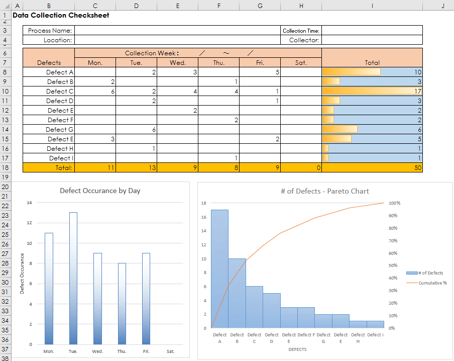
This is a Checksheet. This example is for data collection. You would record the number of occurrences by category on the sheet. The collected data will be analyzed later. There is another kind of Checksheet for mistake-proofing, AKA Checklist or To-Do list. Procedures and notes are written in chronological order for prevention of mistakes. Formats of both for data collection and mistake-proofing should be customized. Consider who uses this sheet for what purpose and what results are expected, then decide the format.
Histogram

Next is a Histogram. This diagram represents occurrence frequency of one data group graphically. You can understand which numeric range is the most frequent at a glance.
Scatter Diagram

This is a Scatter Diagram. You can find if there is any correlation between a pair of data and what kind of correlation.
Control Chart

This is a Control Chart. It has three straight lines of center, upper-control limit and lower-control limit on a line graph. When observed plots go out of the control limits or have some specific tendencies, you can see that they were “special cause variation” and investigate any problems in the process before a large problem actually occurs.
Stratification
The last one is Stratification. This is not so much a tool, but more of a method of thinking. You can use this method anytime you do a data analysis. Actually, you have to.
When you did a data analysis, you’ve sometimes gotten meaningless results, haven’t you? At those times, by dividing the data you used by category and conducting the same analysis separately, many times those results become meaningful. That is Stratification.
These were explanations of the 7 QC Tools. Thank you very much for viewing. If you like my videos, please click the ‘Subscribe’ button. Thanks.